Extending the analysis: response dynamics
Concept
The primary analysis reduced each participant's behavior in each phase to a single number of clicks per minute. That helped us to answer the question the study was designed to ask. But it also ignores a bunch of additional information (e.g., how responding was distributed within each phase). For example, two participants with identical response rates may have clicked steadily throughout, or in a burst followed by nothing. Two phases with the same average may describe a stable pattern in one case and a steady reduction in the other. Behavior happens in time and the timestamps that recorded it are still in the file. Why not use them?
This lesson shows you AI systems like Claude Code allow you to explore and conduct analytics beyond what you may have thought possible in the past. We do this primarily by examining within-phase response structure. These analyses would not be possible had the experiment logged only totals. As you build out experiments, setting yourself up with as much data detail as possible will allow for more analytic options.
A note on the data
The figures below use the simulated cohort in data/synthetic/, cleaned as in lesson 14:
38 participants, 9,119 responses. Because this data is simulated, the dynamics described
here are properties of the generating process.
Interresponse time (IRT)
A rate of 44 clicks per minute means a click roughly every 1.4 seconds. The interresponse time (IRT) is the gap between one click and the next and it can be analyzed for potentially useful information.
Ask Claude:
For the cleaned data, compute interresponse times on the target buttons (R1 and R2) within
each phase. Report the median interresponse time per participant, then
summarize those medians across participants for each phase.
What comes back:
median inter-response time per participant (first four of 38 shown)

participant     phase 1   phase 2   phase 3
c0xiwarmi7        0.690     0.495     0.664
c1wkdb8i1p        0.738     0.680     2.500
c2qiyrbhcu        0.749     0.517     0.983
c4rnprurki        0.788     0.638     1.391

those per-participant medians, summarized across participants

phase 1:   median 0.736 s    (interquartile range 0.596 - 0.851,  n = 38)
phase 2:   median 0.650 s    (interquartile range 0.585 - 0.993,  n = 38)
phase 3:   median 2.598 s    (interquartile range 1.550 - 3.532,  n = 35)
Reading the output: When clicking a circle led to points, the typical participant clicked that circle about every three-quarters of a second in phase 1 and about every two-thirds of a second in phase 2, and the participants IRTs were similar, since the middle half of them fall between 0.58 and 0.99 seconds. In phase 3, when nothing happened following clicks, the typical IRT more than triples to two and a half seconds, and the range of participants' IRTs increases.
The cumulative record
The cumulative record is a traditional display in behavior analysis, and it shows rate as a slope. Every click steps the line up by one and the line never descends, so steep means fast, flat means stopped, and a change in rate appears as a bend.
Ask Claude:
For one completing participant, plot a cumulative record of target-button clicks using
the elapsed seconds on the horizontal axis, cumulative click count for each button on
the vertical axis, and one step up per click. Draw a vertical line at each phase boundary,
at 120 and 240 seconds, and label them. Also give me the cumulative count at each minute so I can
read the slopes off the numbers as well.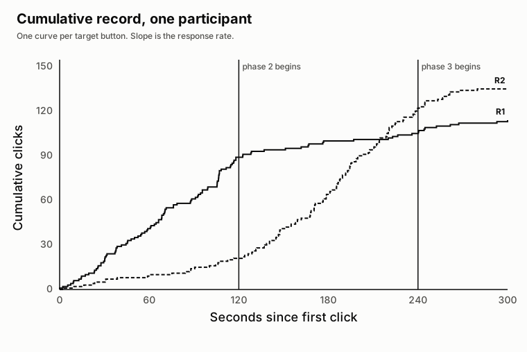
The cumulative counts at each minute are 1, 41, 89, 100, 105, and 113 for R1, and 0, 10,
21, 64, 122, and 135 for R2.
Reading the output: Look at the slopes. R1 increases by 40 and then 48 clicks in the two
minutes of phase 1, then by 11, 5, and 8 in the three minutes that follow. R2 does
the reverse, increasing by 10 and 11 in phase 1 and then by 43 and 58 across phase 2. The two
curves cross at about 215 seconds when cumulative R2 clicking becomes greater than
their cumulative R1 clicking. Each curve bends sharply at 120 seconds, in opposite
directions, when the contingencies changed.
Both curves flatten after 240 seconds. That is the phase 3 boundary, and the bend there is another visualization of the central finding of the study.
Fitting a model to the inter-response times
Quantitative models are a routine part of behavior analysis, and you can use them with a prompt. For example, the bouts-and-pauses model of Shull and Grimes is a common one, and Falligant and colleagues have applied it to clinical data. It treats responding as bursts of fast clicking separated by longer pauses, and it is fitted to the distribution of inter-response times as the sum of two exponentials: a fast one for gaps within a bout, and a slow one for the gaps between bouts.
The data display that goes with it is the log survivor plot. For each IRT length t on the
horizontal axis, the proportion of IRTs longer than t is plotted on a log vertical axis.
The log axis is what makes the plot readable: on it, one exponential is a straight line, and
a mixture of two is a bend. A steep first segment is the within-bout gaps running out, and
the shallower segment after it is the between-bout gaps.
Ask Claude:
Fit the two-exponential (bouts and pauses) model of Shull and Grimes to the phase 1 and
phase 2 IRTs on the target buttons, one participant at a time. Then show me two log
survivor plots side by side: one participant the model separates into two components,
and one where it does not. IRT length in seconds on the horizontal axis, proportion of
gaps longer than that IRT on a log vertical axis, with the fitted curve over the data.
Report the two fitted rates for each participant.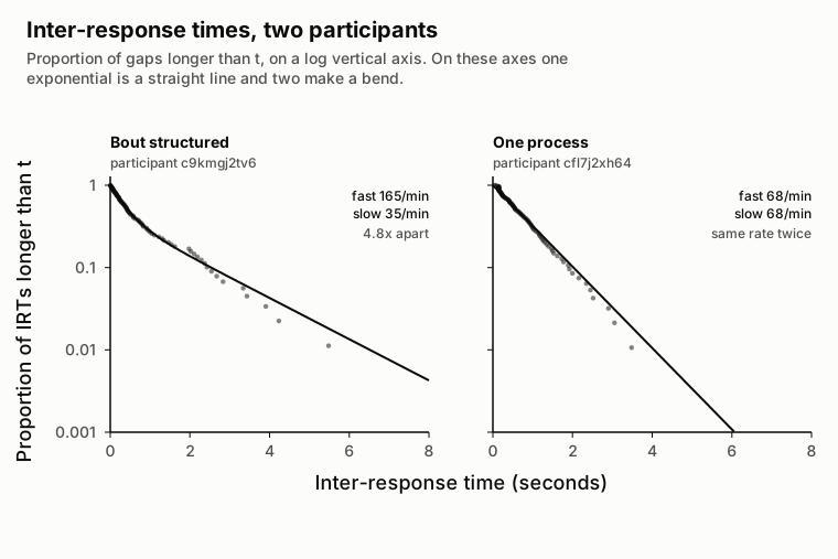
Reading the plot: The left panel has two distinct lines, one corresponding to the within bout responses and the second corresponding to the between bout responses. The right panel looks more like a single straight line suggesting this individual did not have clear within-bout or between-bout responses. Both participants were responding to the same contingencies.
These specific findings are neat! However, the more general point is that the model is one prompt away. There are some additional things to be aware of if you want to go down this path. And, if you do, there is a course specific to this at behavior-modeling-course.vercel.app.
For now, however, just know that the quantitative analyses of behavior are now just a conversation with Claude away.
Key points
- A rate is an average over a period and says nothing about the distribution of responding within it. When something changes inside a phase, the rate does not show it.
- IRTs cost nothing to compute and reveal spread that a rate cannot express. In phase 3 the typical gap tripled and the variability between participants grew.
- The cumulative record shows rate as slope. The bend at the phase 3 boundary, and the absence of a bend at the phase 2 boundary, are both visible in it.
- Extinction in these data is a continuous decline from 28 to 2 clicks per minute across one minute. The reported phase average of about 11 describes the behavior at no point in the phase.
- The distractor declined on the same schedule, which supports a claim about task engagement rather than about extinction of a specific response.
- None of this analysis would exist if the instrument had recorded counts instead of timestamps. Analytic possibilities are determined when the study is built.
- Quantitative models such as the bouts-and-pauses model are one prompt away. Ask for the standard plot alongside the parameters, because the plot shows whether the model found what it was looking for.
Exercise
Produce a cumulative record for a participant other than the one above, and mark the phase boundaries. Describe in two sentences where the slope changes and where it does not. Then re-bin phase 3 using five-second intervals instead of ten and compare: state one thing the finer bins show that the coarser ones did not, and one way the finer bins are less reliable.
Checklist
Use this when a summary statistic may be standing in for a changing process. Read it yourself, and paste it to Claude to have it examine the dynamics.
- Every reported rate is accompanied by a measure of spread, not only a central value.
- Inter-response times are examined directly, not only through the rates derived from them.
- Any period during which behavior is expected to change is divided into intervals and inspected, not summarized with one number.
- The bin width is stated, and the result is checked at a second bin width.
- Binned rates reconcile with the overall rate for the same period.
- Change over time is displayed, by cumulative record or equivalent, not only tabulated.
- Control conditions (here, the distractor) are examined over time as well, so a general change is not reported as a specific one.
- Questions the measurement resolution cannot answer are made explicit and not answered.
To use this with Claude, paste the checklist and add:
Examine the within-phase dynamics of the cleaned data in data/synthetic/ rather than the
phase averages. Compute inter-response times per phase with their spread, produce a
cumulative record for one participant, and bin phase 3 into intervals to show the time
course. Check that the binned rates reconcile with the phase rate, and repeat the binning at
a second width. Tell me which questions the timestamp resolution cannot answer instead of
approximating them.